Tenant Proposition - Spotahome
As UX Lead for Spotahome’s tenant facing site, I was tasked with designing AB tests with the aim of increasing the booking request conversion rate.
Spotahome is a startup offering mid-term room and apartment rentals in various cities in Europe. They employ “Homecheckers” to validate their rentals and produce professional property listings so prospective tenants can book without viewing the property in-person.
The analytics for the existing booking flow showed a large drop off at the point where users were asked to submit their booking request. I did some remote user testing on the existing booking flow to better understand the reasons for the drop off.
It was clear that users did not understand or see the value in Spotahome’s proposition. Most expected to be able to visit a property before committing.
I ran a workshop with Product and Engineering managers to identify opportunities to improve the booking experience and better convey the proposition to tenants.

Engaging the wider team meant a broader knowledge set in the room and helped to ensure buy-in for my design ideas further down the line.
Test 1. Enhancing tenant proposition in the homepage hero banner
The existing homepage headline and imagery were unclear, the dates suggested short-term holiday rentals, and the CTA “Explore” was vague.

I began working on alternative designs which better explained the benefits of the Spotahome proposition. I aimed to set user expectations more clearly by removing the dates and making the CTA more specific.
I ran a series of preference tests to see what type of imagery and proposition strapline worked best for representative users.
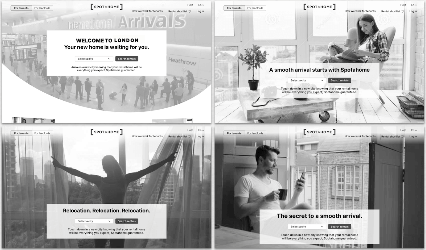
The first production-ready design iteration was AB tested against the existing control.
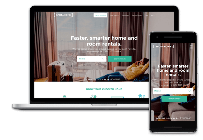
The results of the AB test showed a reduced bounce rate, increased successful sessions and an improved conversion rate.
The test candidate was declared optimal. Future tests are planned to further iterate on copy and imagery.
Test 2. Enhancing tenant proposition in property search results page
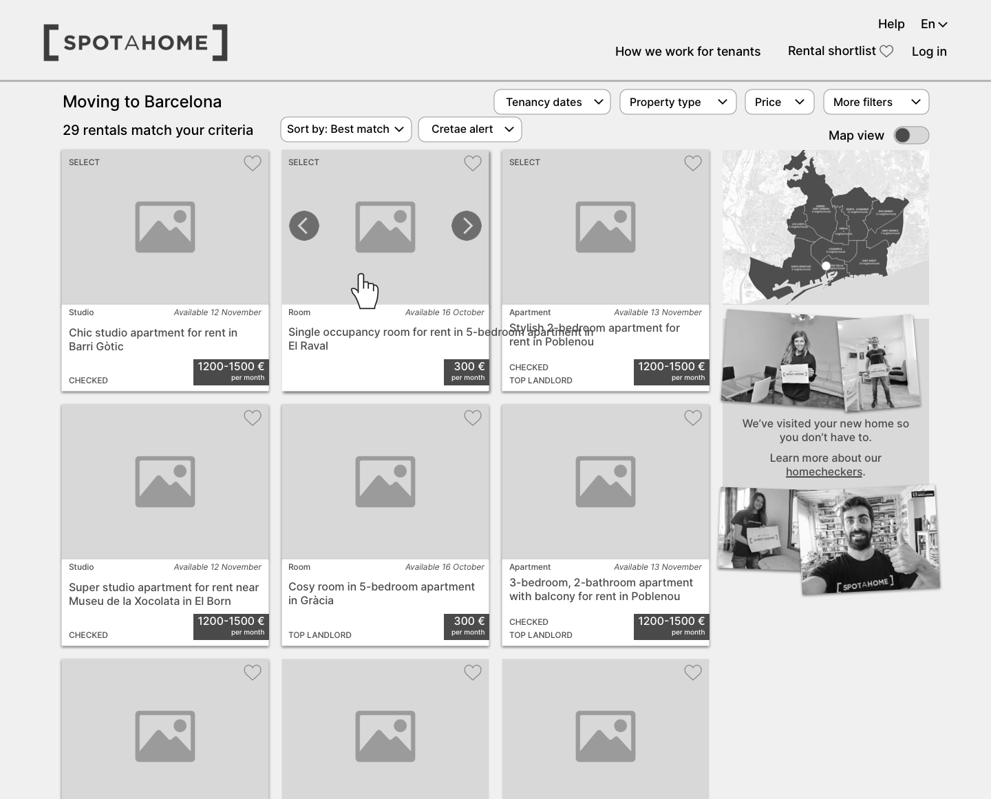
The search result page had a generic design, indistinguishable from competitor sites, with almost no evidence of Spotahome’s unique proposition.
The location map was given more than half the page on desktop, leaving little room for the property images and details.
Essential filters were only visible after clicking the filters button.
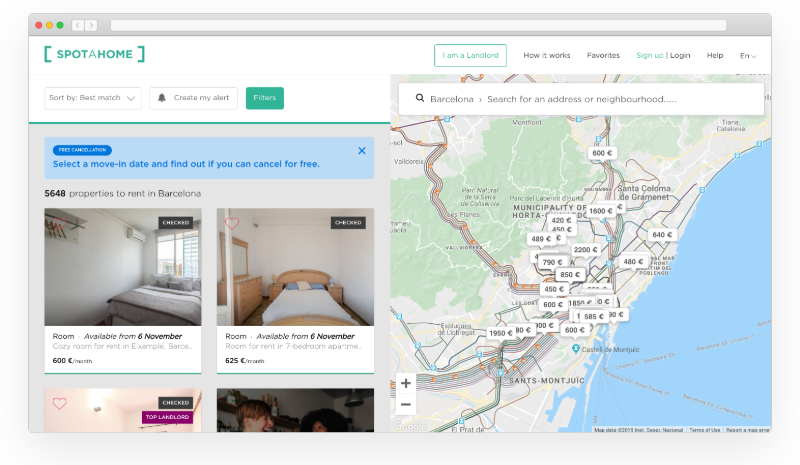
My first idea was to refocus the page on the search results instead of the map. I also added content to the right hand column to introduce the Homechecker proposition.
I improved the utility of the page by adding an image carousel to each property card enabling users to get a better impression of each property. I also surfaced the most important filters to help users reduce the number of results to a manageable number.
Faced with so much choice, research showed prospective tenants first looked for reasons to discount properties, making their initial judgement on the property photos alone. I considered different options to provide users with larger property images at their native 16:9 aspect ratio.
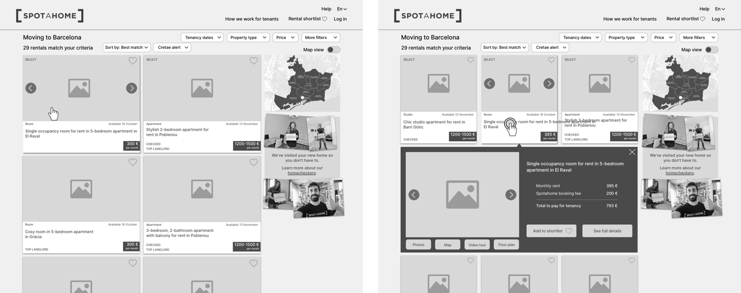
I switched to a list layout with the aim of helping users narrow their search by focusing on one property at a time. The cover image for each property showed the homechecker in-situ reinforcing the key proposition.
The Homechecker ribbon at the base of each property card was intended to indicate that the package has been put together by that specific Homechecker. On hover, the ribbon retracts and the user can swipe through the photos - the thumbnail map also indicates the property’s approximate location.
As the design progressed the wireframe had come to include a lot of new ideas. Rather than develop and launch them all in big bang, we agreed to break down the design to its component parts and release each as an AB test.
Here you can see the final UI design for the on-page filters. The results of these tests are not available.
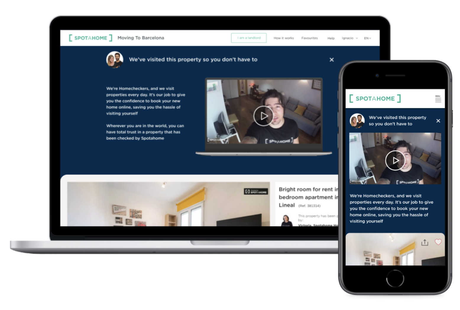
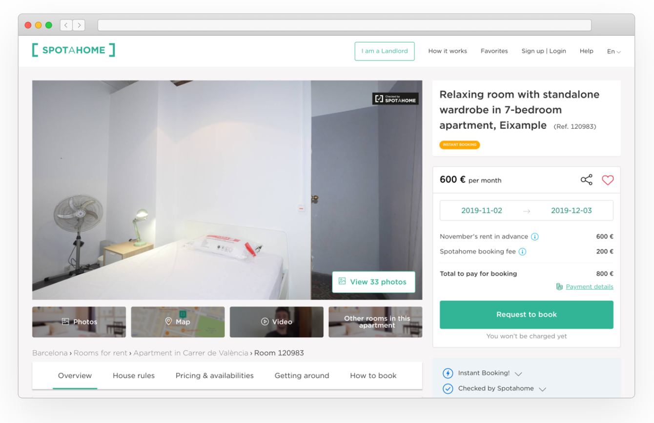
Test 3. Enhancing tenant proposition in listing page
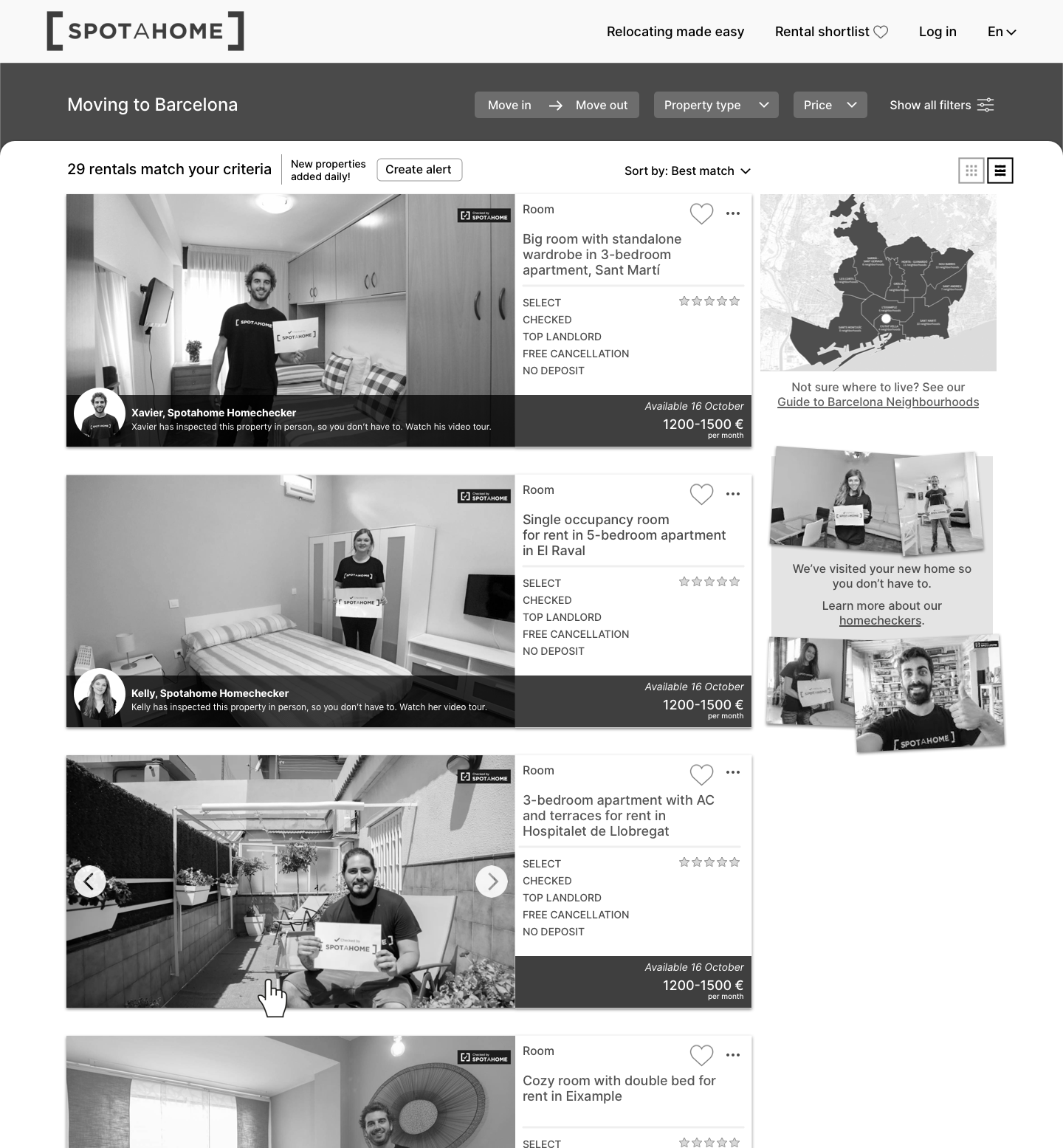
A big chunk of site traffic was arriving directly onto Listing pages, largely from property aggregators. Users would be expecting a typical property listing site so it was especially important to try to convey our unique proposition.
The existing page template contained a lot of content which users valued in testing, including the unique video-tour shot by the Homechecker during their visit.
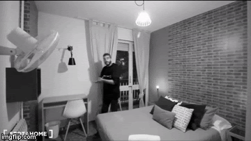
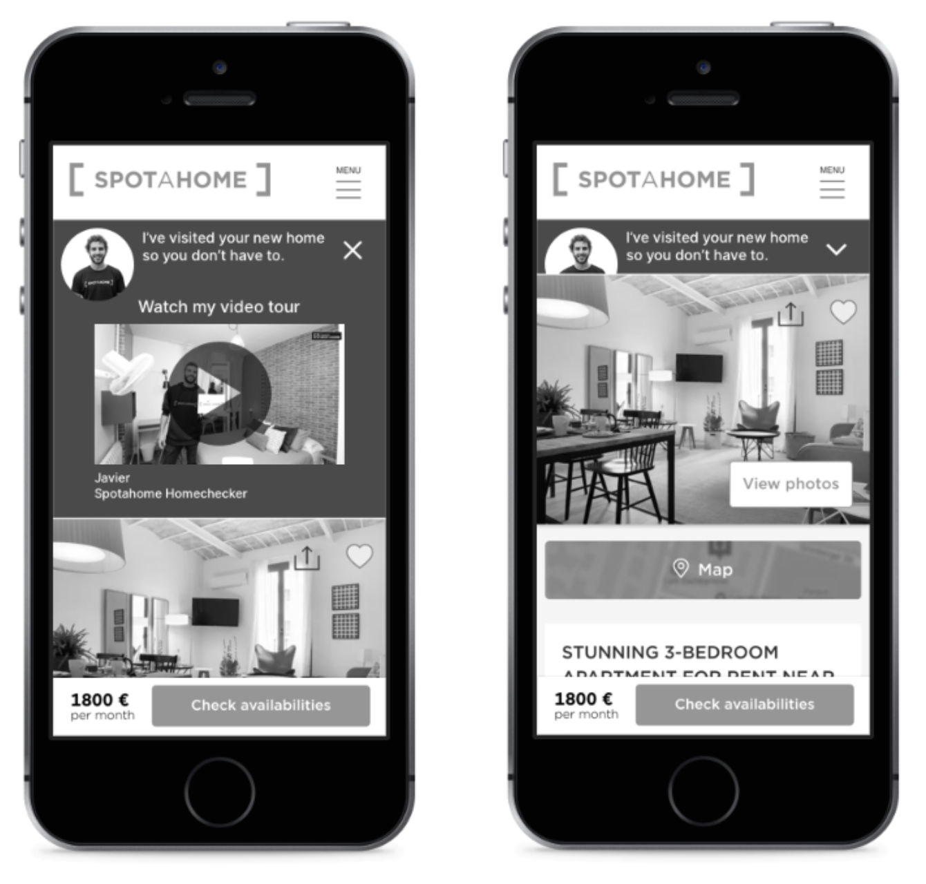
I designed a new proposition panel to appear above the main listing content. The panel featured the video from the listing and introduced the relevant Homechecker. A pre-play animation showing frames from the video was intended to draw attention to the video content and increase video play rates.
The proposition panel could be closed or just scrolled past by the user to avoid disrupting their journey too much.
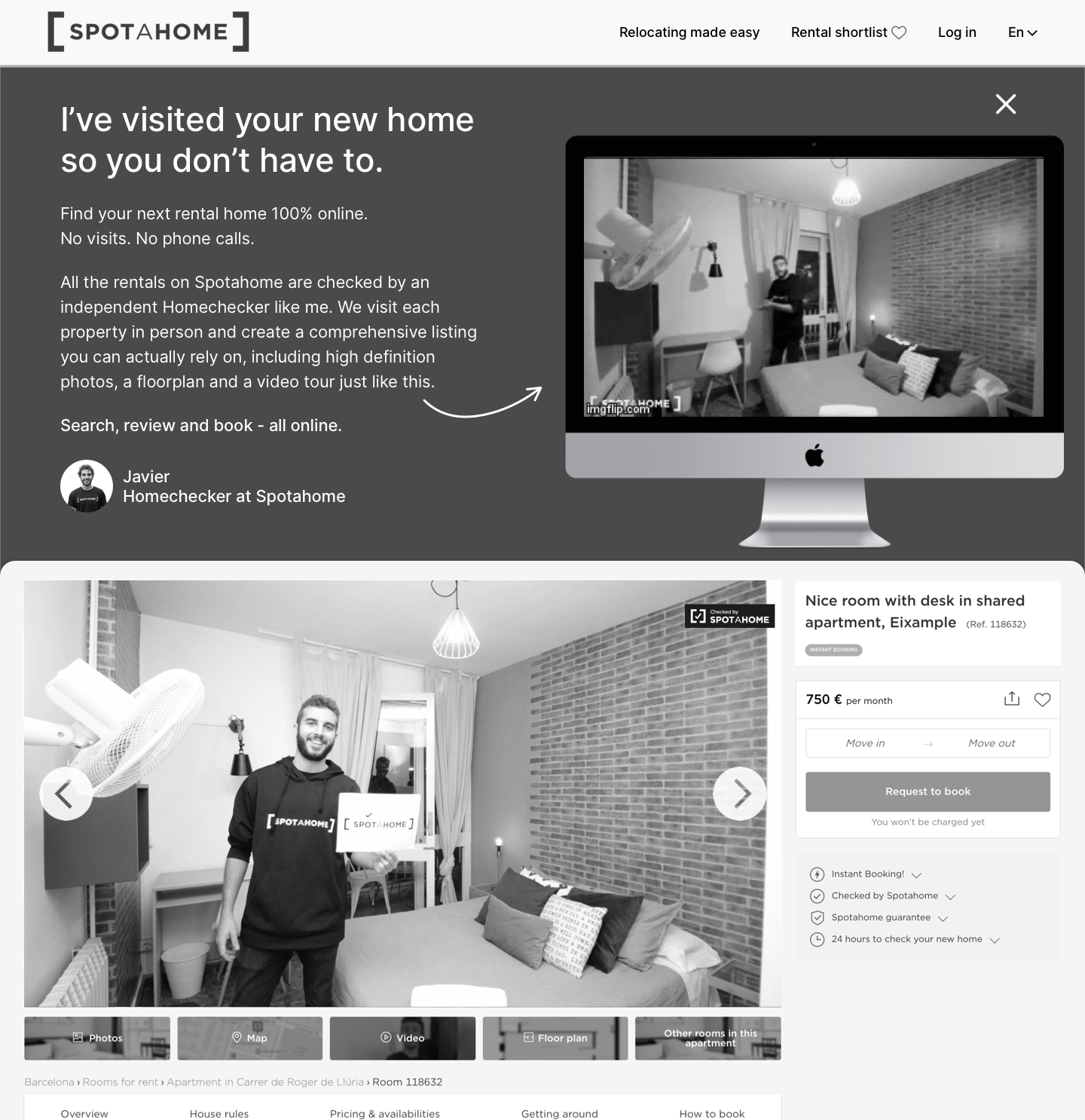
We knew that prospective tenants would view an average of eight listings per session so I specified that the proposition panel should only appear open by default on the first listing page visited.
Having seen the proposition panel open on first listing page viewed, all future listing pages viewed show the proposition panel closed, with the Homechecker’s profile image peaking above the listing.
The Product Manager was unwilling to invest in automating the animation production so the design that went into AB test included a single generic Homechecker animation instead of a preview of the specific Homechecker in the actual property.
Results showed an improvement in some engagement metrics - time on page and bounce-rate, but did not significantly alter successful sessions or the conversion rate.