Strategic communication - Dashboard
Dashboard is an IIoT startup working on digital monitoring and modelling of industrial infrastructure. I was asked to redesign their website to better reflect the company and product as they move into the next stage of their growth.
Choose your words
Dashboard inhabits a world of artificial intelligence, machine learning, big data, neural networks, and edge computing. Any one of these subjects has the potential to fascinate an engaged reader. But moderation is essential. Even technically literate readers will struggle with too many buzzwords, resulting in less effective copy, where sales messages are muddled or missed.
Alongside the technical jargon, Dashboard's communications included a lot of management-speak. Harnessing, empowering, capitalising - overuse has rendered these words inert. Eyes glaze and the brain wanders.
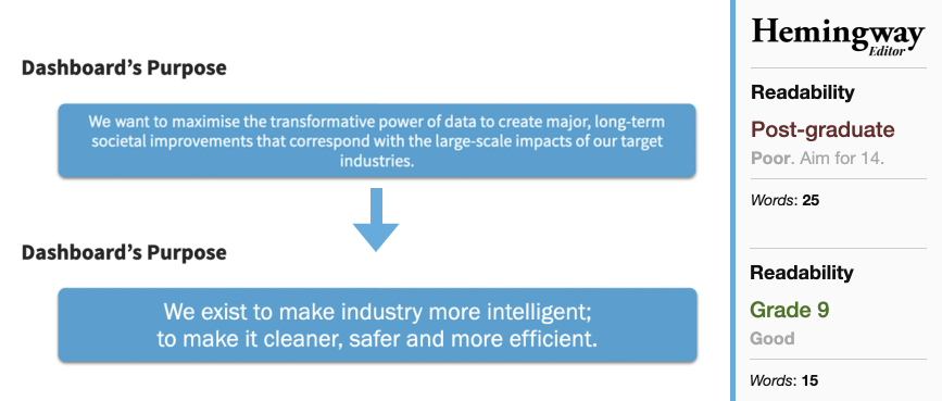
Fewer words, simpler sentences
When writing body copy, I like to imagine the words I'm writing being spoken in conversation. The context for the conversation will depend on the brand and product - it might be a casual chat between neighbours in the street, or a more formal one-to-one meeting with a colleague in the office. This context determines the tone of voice. But in general, words and sentences spoken in conversation are short and simple, and allow room for the other party to follow along, ask questions and confirm understanding.
I rewrote Dashboard's purpose statement to illustrate this change in style. I also introduced the Hemingway App as an objective way to measure the readability of copy.
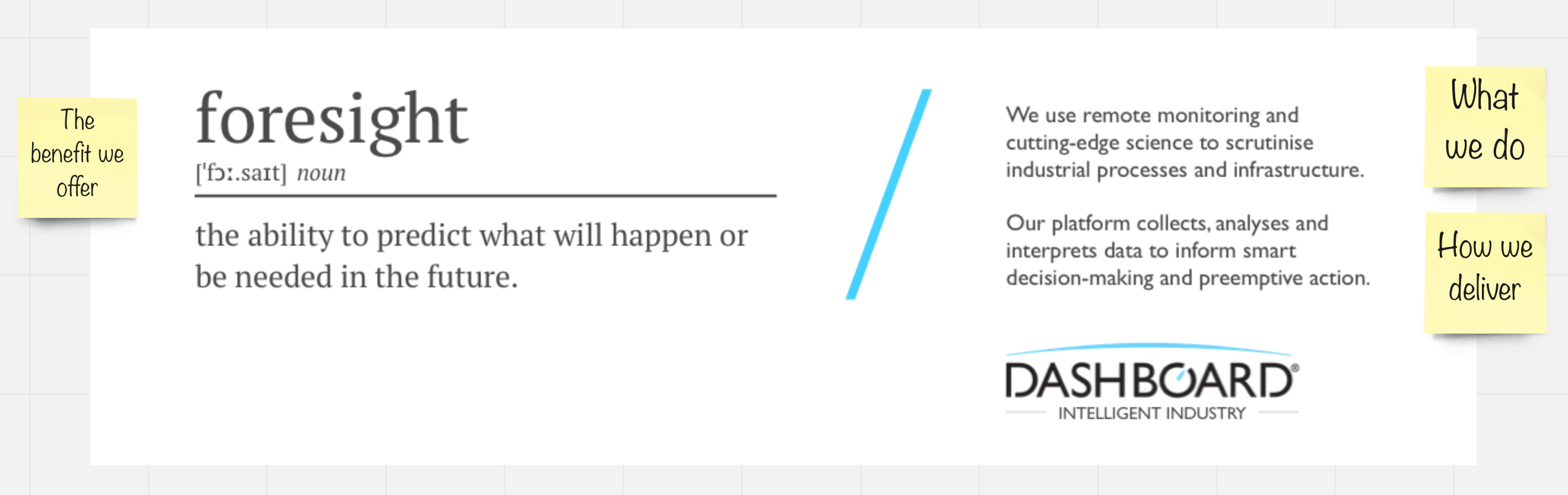
The benefit of foresight
In the course of the discovery phase of the project I conducted a series of one-on-one interviews with members of Dashboard's team. Without access to customers, I was reliant on customer-facing personnel to act as a proxy to convey customer needs and perceptions. We discussed many applications for Dashboard's products and services, but one which stood out as consistently valuable to customers was the field of Predictive Maintenance. Knowing ahead of time that a component was about to fail. Or conversely, knowing that a component was in good working order without the need for routine inspection.
The Dashboard team had been talking about actionable insights as a product proposition, but I was concerned by the huge number of other companies who could claim the same - it wasn't sufficiently ownable. Instead, I chose to focus on the superpower that enabled Dashboard's predictive maintenance solution; The data and insights enable decision-makers with foresight.
An early creative concept used a graphical definition of foresight to frame the product proposition.
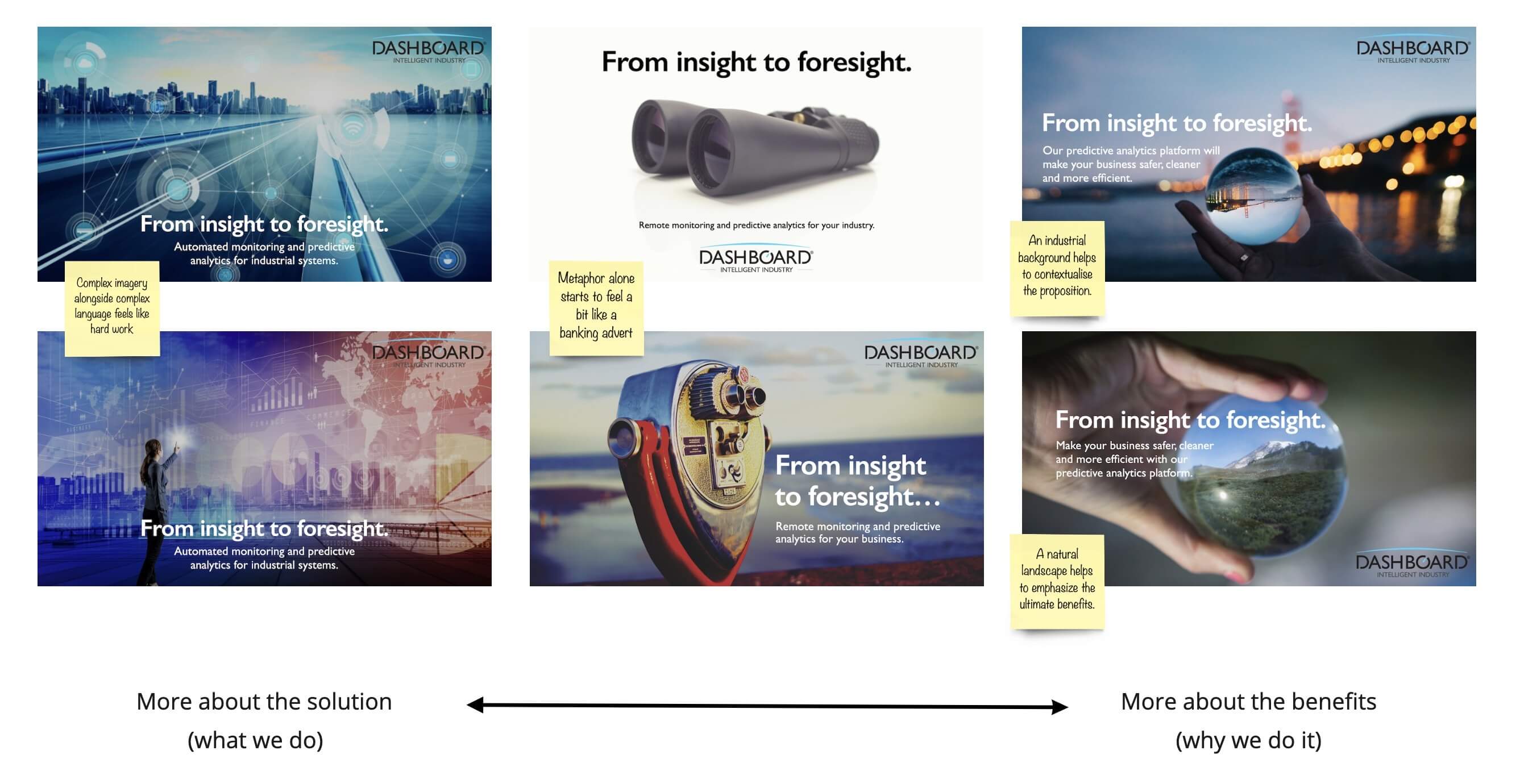
As the idea solidified, I began playing with different imagery to reinforce the proposition. First, using futuristic looking data visualisations, then trying various visual metaphors. The crystal ball provided a versatile visual metaphor, which could be used in combination with different background themes. It was also suitable for cropped close-ups on mobile viewports and wide landscape shots on desktop.
Extending the metaphor
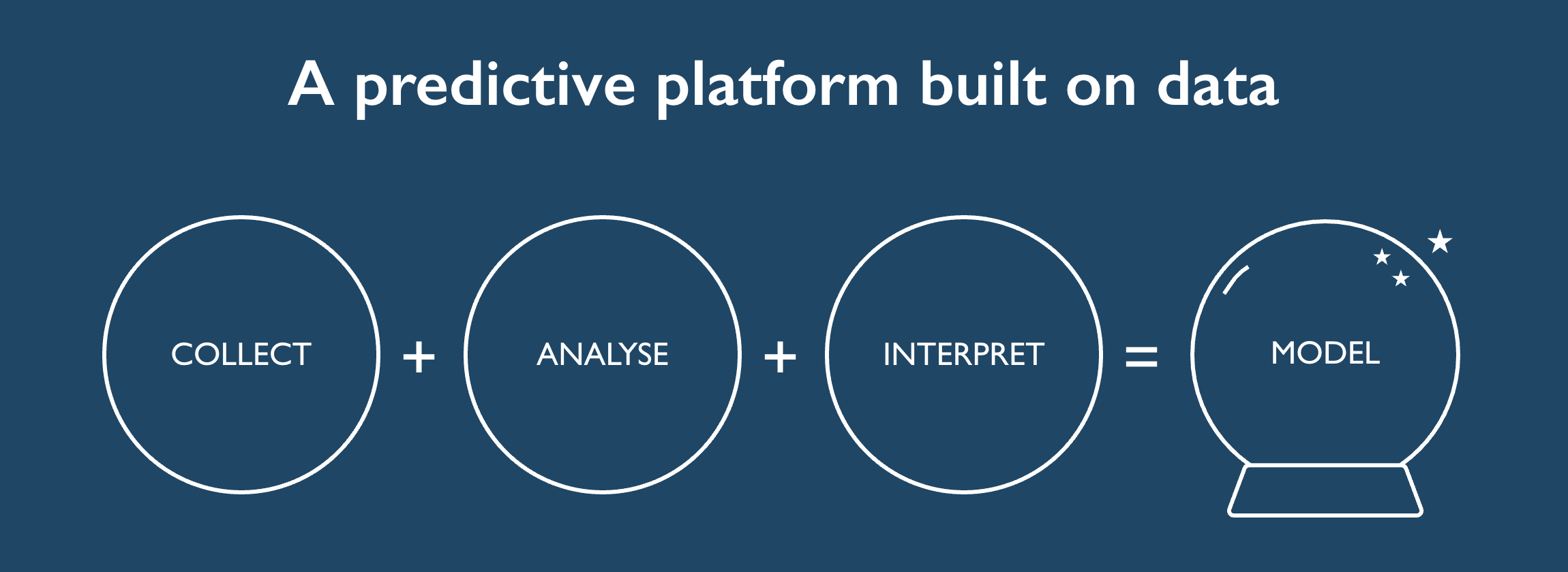
I wanted to describe Dashboard's IIoT platform in simple terms. To explain that it worked by first collecting vast amounts of data. Then performing detailed analysis on that data to identify patterns. Then interpreting the observed patterns to model probabilities - the likelihood of a component failure for example.
Restricting the imagery to a simple line-drawing helped to avoid reader fatigue when describing complex subjects.
Inside the crystal ball
I worked with Guy Hawkins on the script for Dashboard's new corporate video, distilling the new messaging and themes into a succinct narrative. Guy's film takes the viewer inside the crystal ball to introduce Dashboard and their data-centric view of the world. Two minutes of high-energy visuals and a punchy soundtrack mark a distinct change in style for this cutting-edge startup.
Tom has a talent for simplifying complexity. He very quickly recognised the strategic priorities and distilled them into clear, concise and punchy messaging that has made a step change impact on our ability to communicate our purpose and products.
-- David Nicholson, COO at Dashboard Ltd
The team behind the success
There was a lot more to this project than I've covered here, and all delivered with a remote project team. Special thanks to Rob Simpson and Andy Coram for their awesome work on development and animation respectively. Thanks also to the whole team at Dashboard who pulled together to get the content completed. The new website is now live and has been really well received.
