New Site and Product Proposition - Waitrose Cellar
Managed the UX and UI design for Waitrose Cellar, a new site and product proposition, from requirements gathering to BAT.
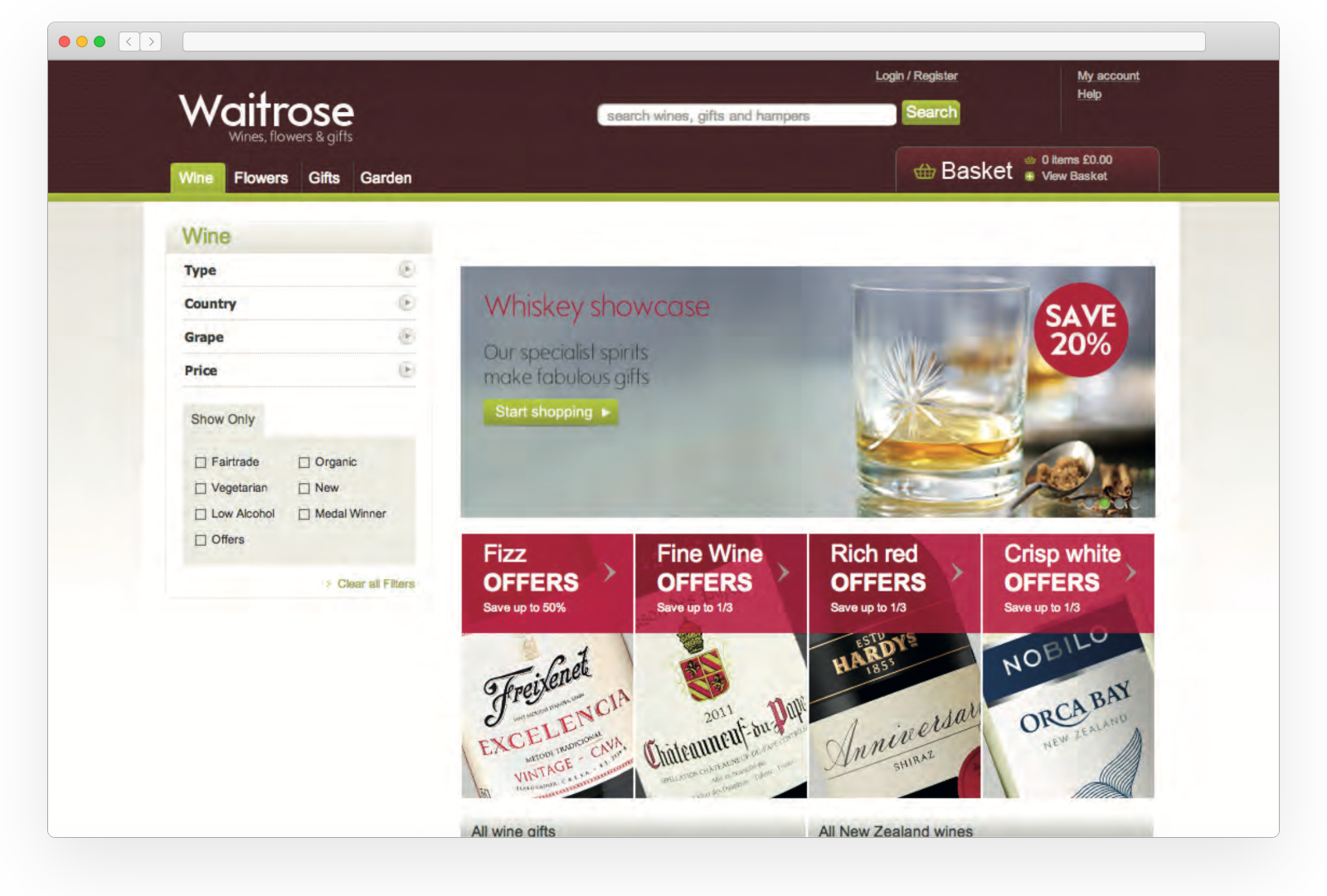
Waitrose' existing wine-by-the-case site was underperforming. Wines Direct was purely transactional, it had no auxiliary content and was heavily reliant on discounting to sell products. Waitrose brand values were noticeably absent.
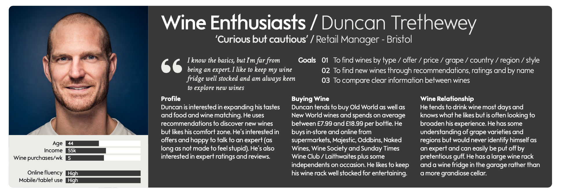
Working with an external agency, my role was to manage the development of the new customer proposition and site design. We began by conducting a series of customer interviews and focus groups to develop an understanding of different customer types. We identified three customer personas with varying levels of wine knowledge and spending behaviours.
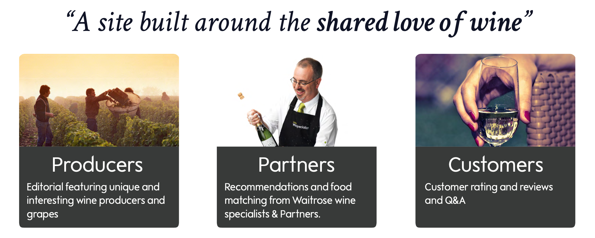
There's a lot of competition in wine retail so we wanted to draw on the strength of the Waitrose brand and the expertise of Waitrose Partners. At the time, Waitrose was the only retailer to have three Masters of Wine within their buying department. We decided to take the shared love of wine as our north star, which was a huge step away from the former Wines Direct 'pile them high, sell them cheap' proposition.
Our research had shown that delivery costs and times were particularly important across all customer segments. We also spent time developing our multichannel proposition to help differentiate our offering from the competition.
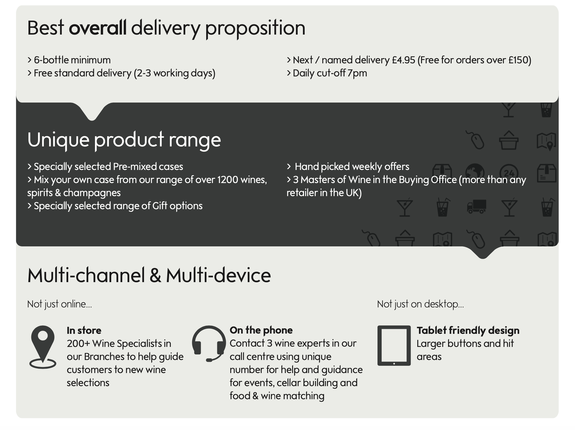
Once we had our proposition agreed we moved into wireframing. We used low fidelity prototypes to test designs early on with customers matching our persona-types.
During testing we identified a key pain-point for customers was the business restriction that, while customers were free to mix their own cases, they had to order in multiples of six bottles.
We designed several wireframe variants to see how best to help customers understand the requirement. The solution we arrived at was to show a six bottle decal next to the checkout button. The bottles changed colour as users added products to their basket, nudging the user toward the nearest multiple of six bottles.

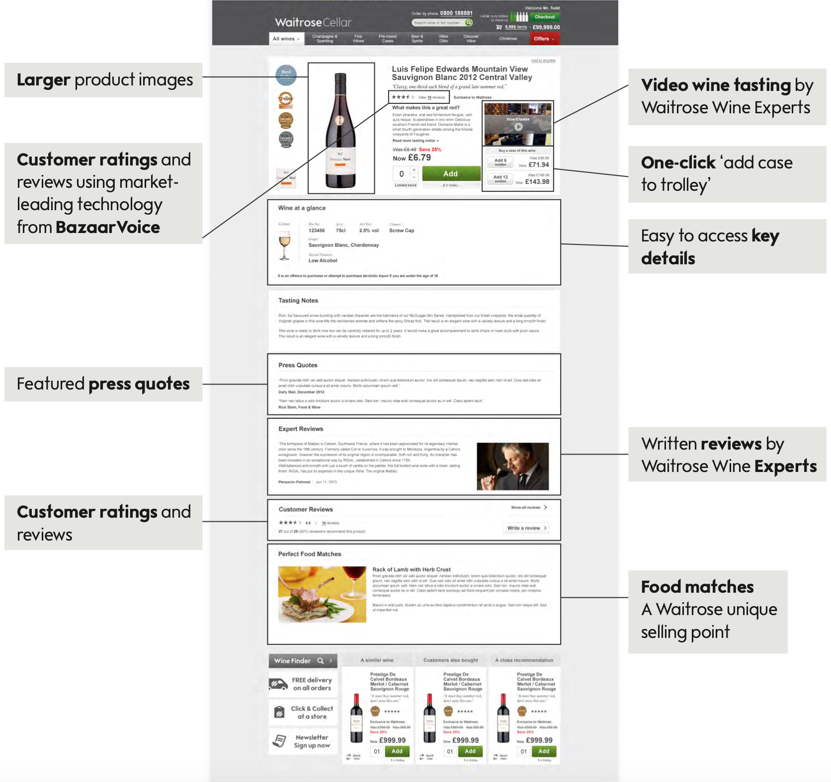
The finished site design was a genuine success for Waitrose. The product page template illustrates how we successfully integrated the product data that was most important to customers, user-generated content, video content, and unique features such as recommended food pairings, which perfectly aligned with the Waitrose brand.
