IA Research and Design - Vodafone
Managed UX research projects including card-sorting and tree testing, guerrilla testing and lab testing to inform website information architecture.
Vodafone's website had been designed to support mobile sales and account management, but the company was now moving to a 'quadplay' product offering (mobile, home-phone, broadband and TV). I managed a number of UX research projects to better understand how to structure their website to support new and existing customers in navigating the expanded product range.
User testing
Our research began by user testing the Vodafone site alongside competitor sites.
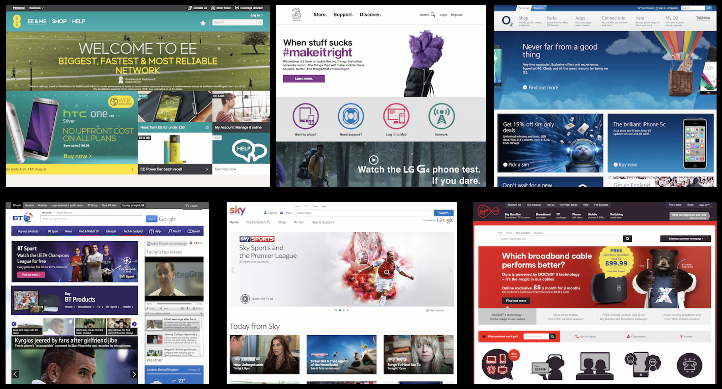
This qualitative research covered key customer journeys for sales conversion and customer loyalty and aimed to identify pain points and best practice UX examples. We also wanted to evaluate users emotional reaction to different sites to understand how we might improve brand perception.
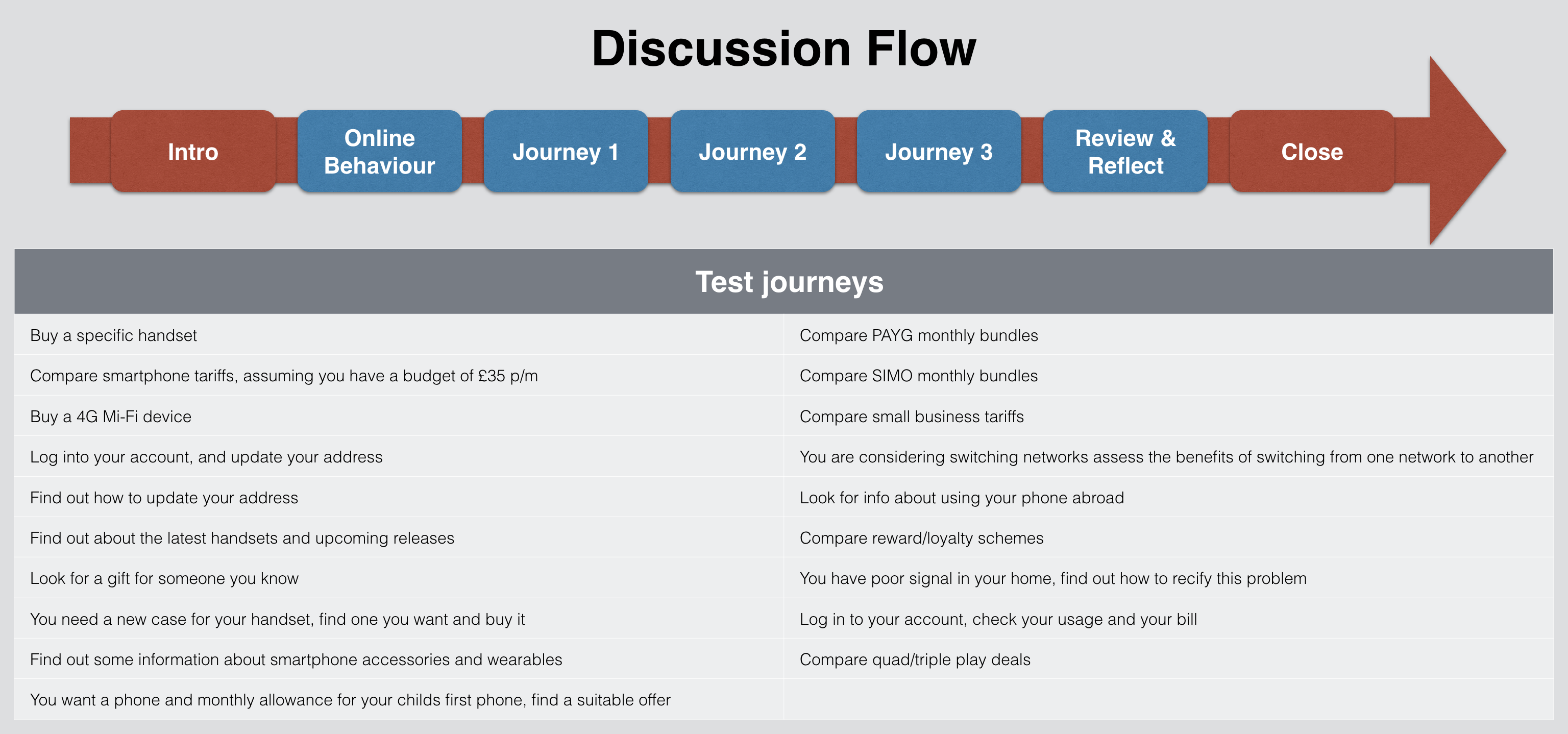
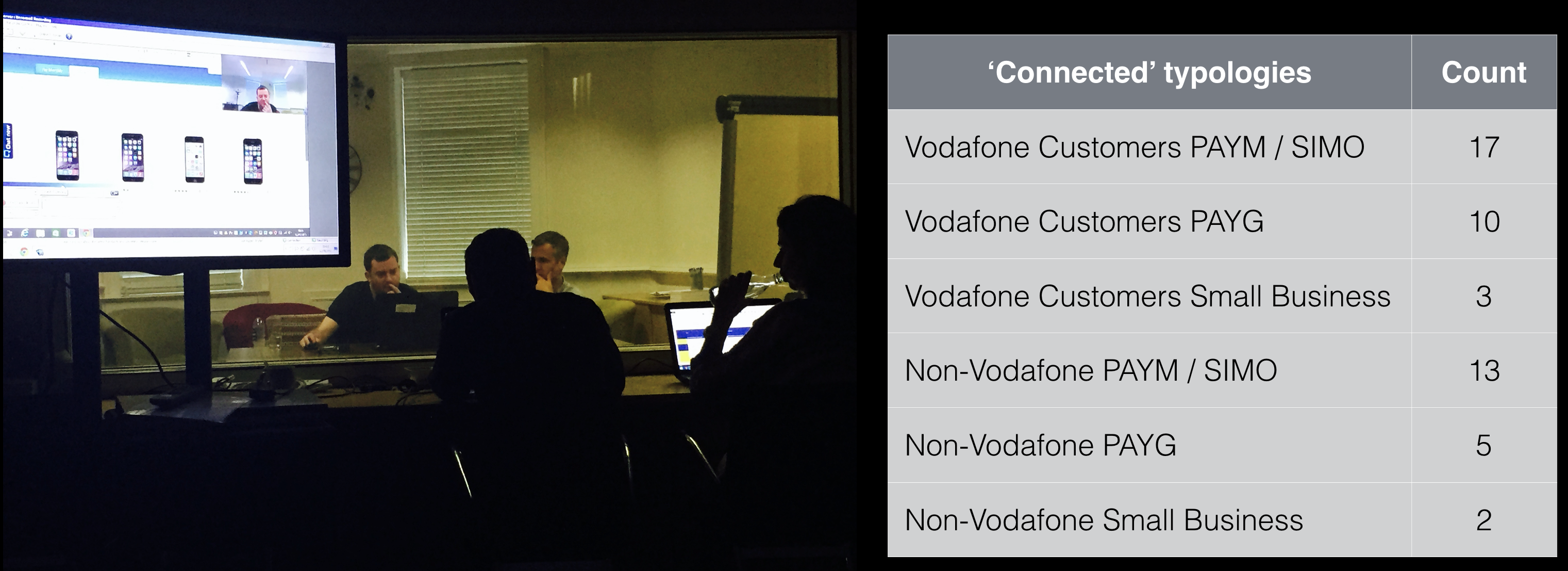
The number of customer journeys we had to cover, combined with different customer segments and different websites meant that this was a substantial project incorporating fifty individual test sessions.
Among many insights gained we found that neither Vodafone nor its competitors were doing a good job of selling quadplay. Product bundles were poorly understood and inflexible. Live-chat features, which may have put been in place to help overcome unintuitive websites, were uninamously detested by users, who resented the interuption.
Card sorting and tree testing
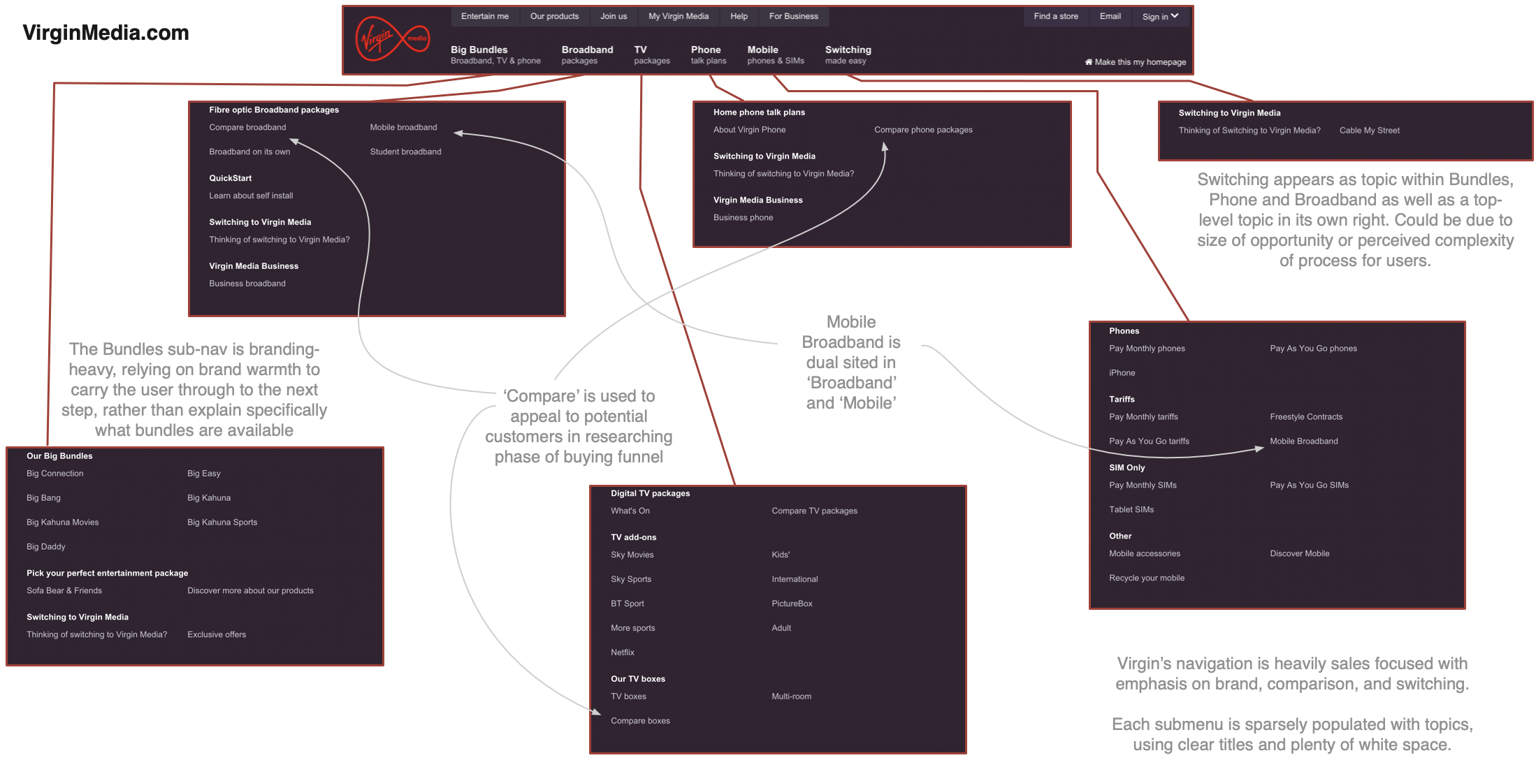
I began by conducting some desk research to analyse competitors’ site navigation and information architecture, documenting observations which could assist in the redesign of Vodafone’s IA. One of the best examples was Virgin Media who had taken the unusual decision to tailor the primary navigation differently for new and existing customers.
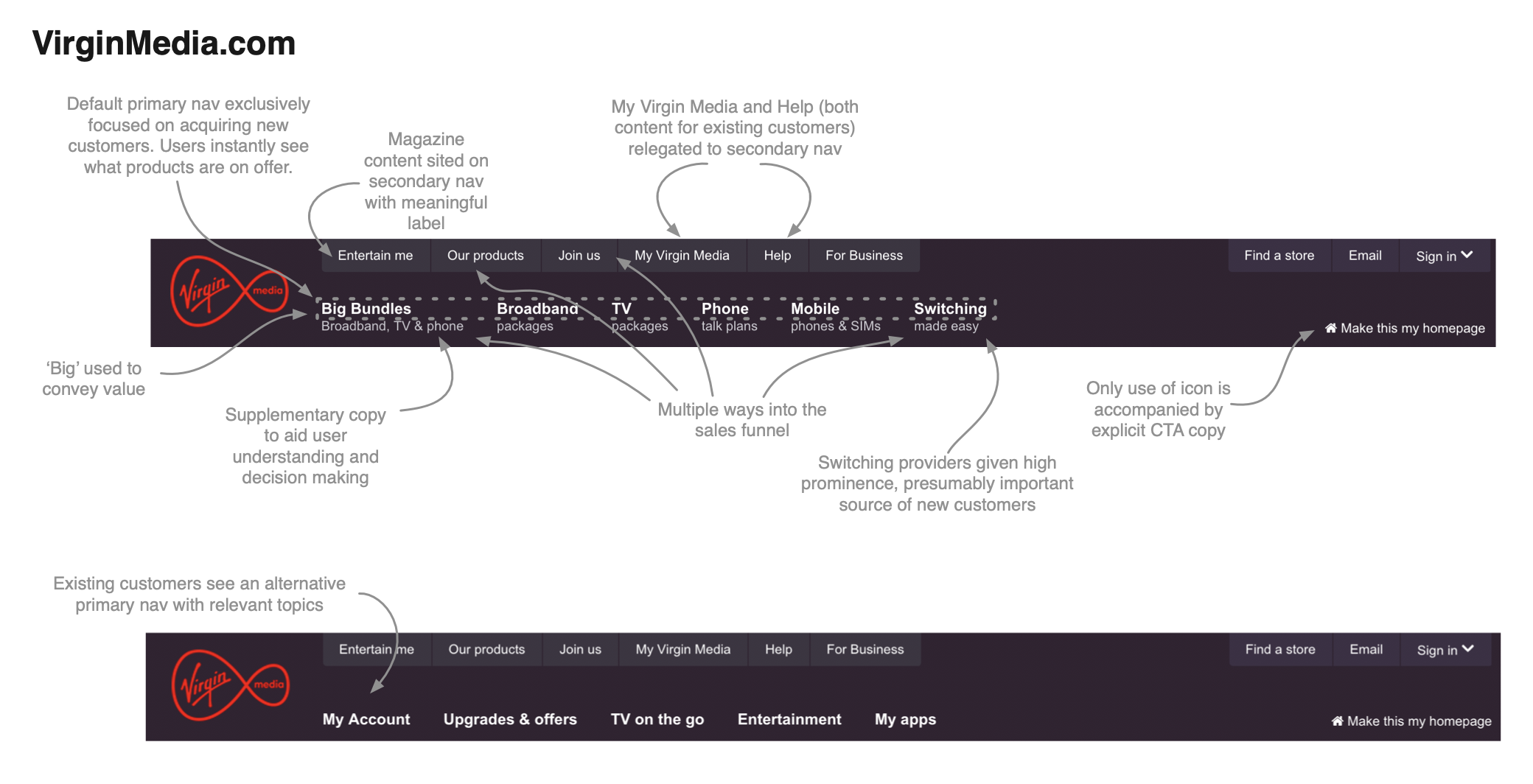
Virgin Media had also chosen to dual site important features such as 'Switching' to ensure that users could find them easily.
Having learned what I could from competitor sites I moved on to primary research. I designed a card-sorting test with the following objectives:
- Understand how users group and label our content
- Find out how users incorporate broadening proposition - mobile, broadband, TV
- Determine what content users believe is most important to them
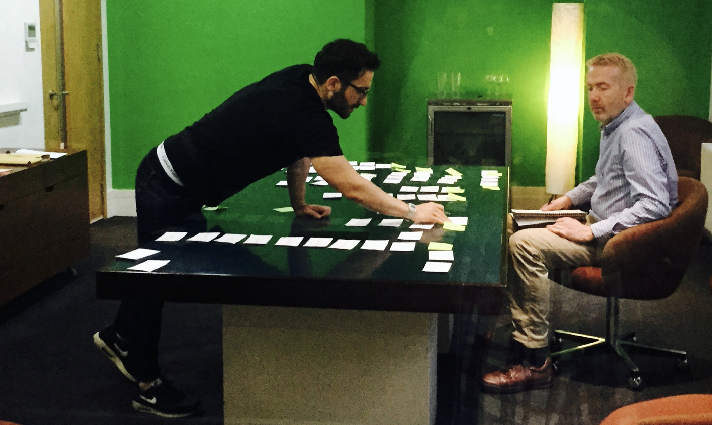
The testing included twelve face-to-face card sorting sessions to gather qualitative data and ensure that the test was valid. I then moved on to remote card sorting to keep costs manageable and to gather quantitative data, providing statistically significant results.
The card sorting revealed some interesting patterns in how users grouped and labelled content.
- ‘Contact’ is high priority and always lives on its own
- All users grouped content by service - Mobile, TV and Broadband. But some also thought about customer lifecycle, grouping content related to switching and getting started irrespective of service
- Nobody created a ‘Help’ category. All supporting information was grouped with the relevant shopping or account content.
- Brand terms were not understood - Sure Signal, Red+, Chromecast
Following the card sorting insights I designed three different IA structures to put through tree testing to see how each performed with users. Again I split the testing between face-to-face and remote to maximise insights collected while keeping an eye on costs.
