Fundraising & Communication - UNFPA
A self-set project I used to practice aspects of design I don't normally get much opportunity to get into on paid gigs. I don’t have any connection with UNFPA.
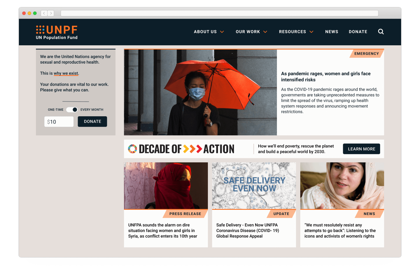
It's no coincidence that fundraising and communications so often come as a pair. Raising money without communicating a need is a hopeless task. While job hunting in New York I had noticed the UNFPA were advertising for a public fundraiser, with the apparent intention of pivoting their funding model from institutions and states to individual donations from the general public. Under lockdown and with time on my hands I spent some time thinking how I might rework aspects of their website with the aim of attracting public donations.
This was a self-set project I used as a practical exercise to help get up to speed on a new design program, and to practice aspects of design I might not normally get much opportunity to get into professionally. It includes a lot of assumptions which could be very far from reality. I don’t have any connection with UNFPA.
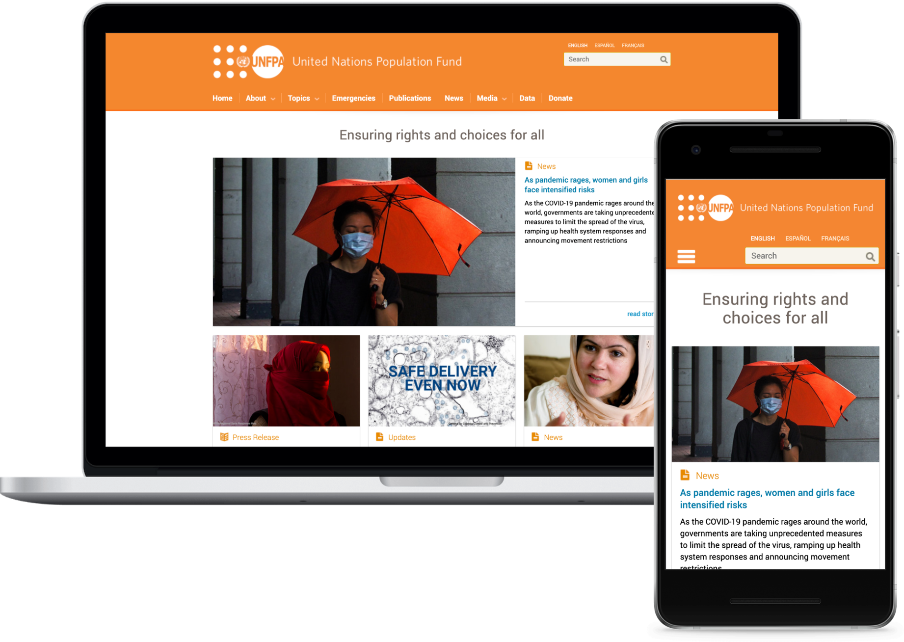
Reviewing the UNFPA homepage I was struck by the lack of introductory information - as a first time visitor there was very little to explain who or what the UNFPA was. A headline “Ensuring rights and choices for all” sounded positive but also vague and strangely passive. Even the name “United Nations Population Fund” is somewhat euphemistic and doesn’t match with the acronym UNFPA. This is the sort of thing that could sow doubt in the mind of a would-be donor - if I can’t understand it, then I’m not going to fund it.
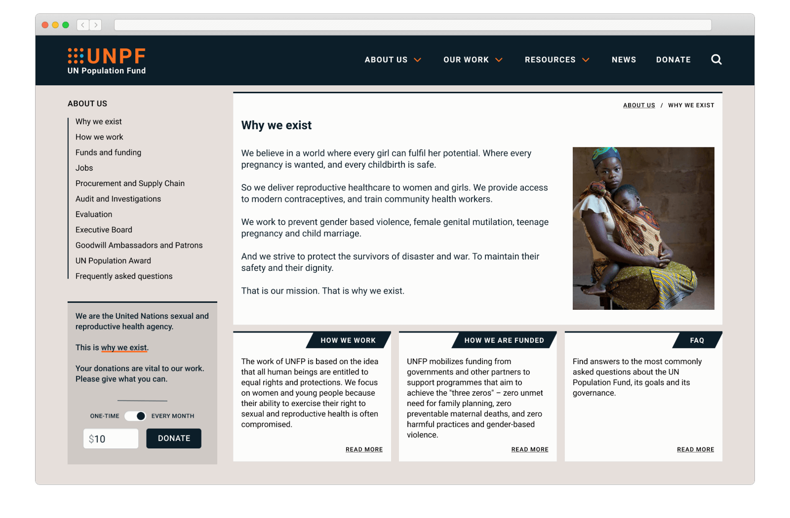
Why we exist
My working assumption is that the general public is unlikely to have heard of UNFPA, much less know what they do. Without that understanding they'll never be persuaded to make a donation. I wanted to include a brief purpose statement that could appear on landing pages throughout the site, and that would link through to more information on the About page for those users who wanted it.
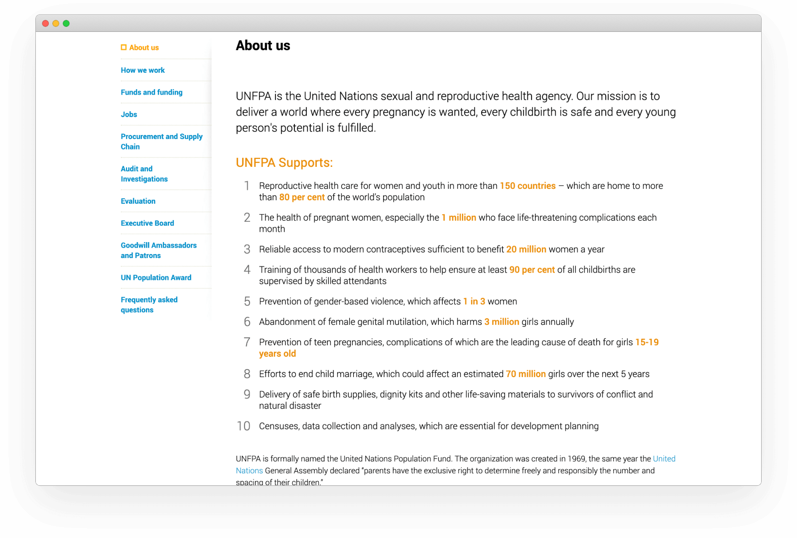
Unfortunately the About page copy was very flat. They appeared to have gone out of their way to remove any people from their mission statement. It's difficult to elicit an emotional response without the people doing the work and the people who stand to benefit. It basically reads:
UNFPA is the United Nations sexual and reproductive health agency. Our mission is to deliver a world where every THING is wanted, every THING is safe and every young person's THING is fulfilled.
The mission statement is followed by a list of ten things that UNFPA supports and I didn't read any further because the text got too small and I'd run out of energy.
Ten-point lists are problematic because inevitably the nice, round number has dictated the content. In this case the writer has focussed on quantifying the different issues by including and highlighting the numbers involved. Individually this could be effective, but together it's extremely fatiguing. I challenge you to read through the list and make sense of the percentages, fractions, ranges and totals, just to see the level of concentration required.
Inspired by Mark Pollard's writing I had a go at reworking the content, trying to keep the language straightforward and unlaboured. Here's my version:
So we deliver reproductive healthcare to women and girls. We provide access to modern contraceptives, and train community health workers.
We work to prevent gender based violence, female genital mutilation, teenage pregnancy and child marriage.
And we strive to protect the survivors of disaster and war. To maintain their safety and their dignity.
That is our mission. That is why we exist.
Having framed the cause, I felt like I the beginnings of a brand from which to build.
Brand logo
According to the FAQs, the UNFPA acronym is a hangover from 1987 when the agency was renamed but the acronym retained. Call it design overreach if you like, but I decided to rebrand to UNPF to match the current formal name of the agency. My game, my rules.
The UNFPA logo is a bit of a disaster visually. The orange and white combination lacks contrast, especially for such a complex amalgamation of shapes and letters. But I quite liked the idea of individual circles within a group making up a population. And I liked that the sixth circle is replaced by the UN logo, albeit at such a small size that it is barely recognisable.
![]()
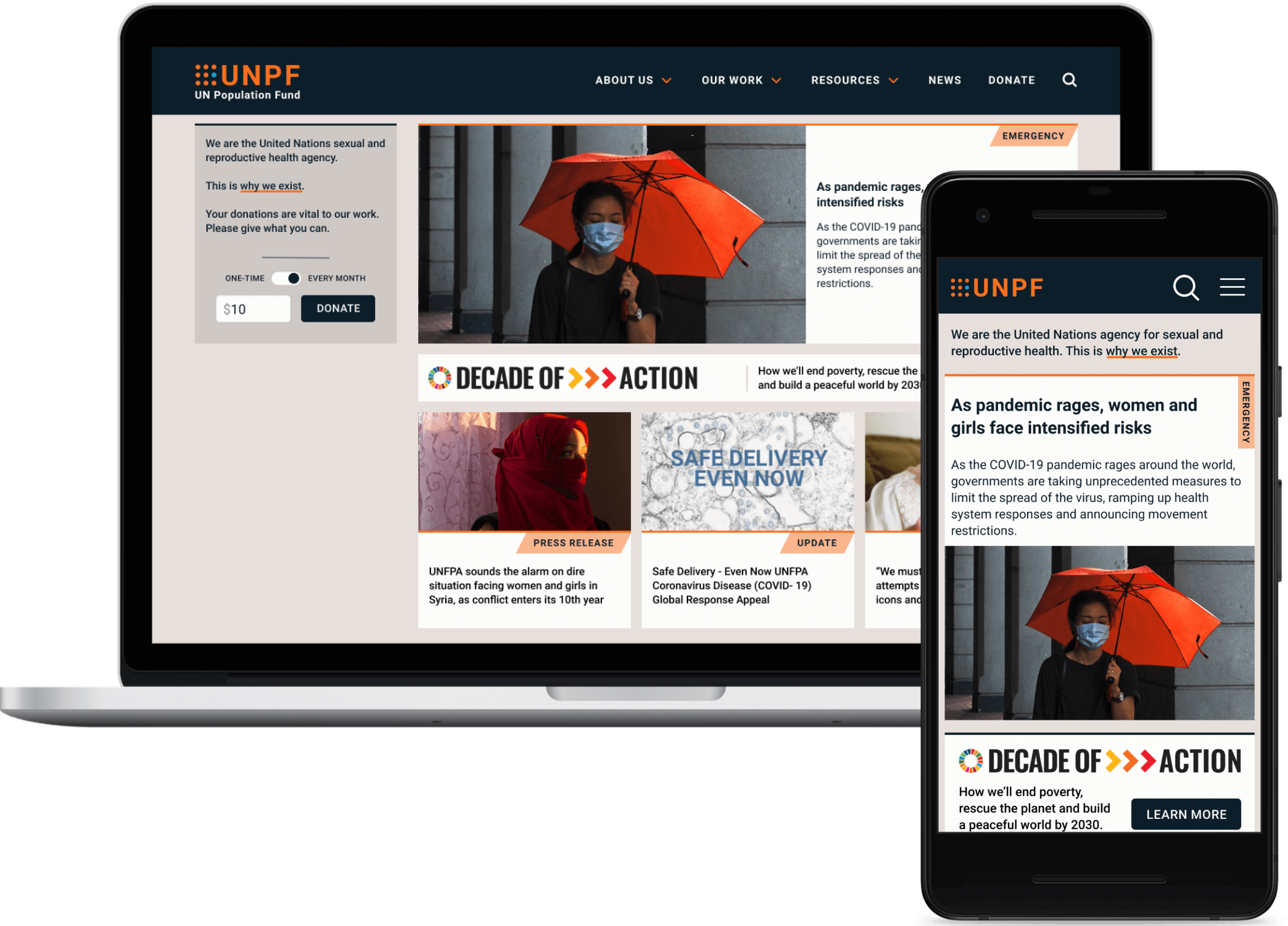
I took those ideas and designed a simpler responsive UNPF logo ↗ which would work across digital media, using a pale blue circle to represent the UN in place of their complex logo. As I said, my hunch is that the UNFPA is not well-known to the public so I chose to include the name of the agency alongside the acronym for larger versions of the logo. I also made some changes to the colours, improving the contrast for more visual impact and so the same tones could be used elsewhere for text content without reducing accessibility.
Primary navigation
Conducting a major IA evaluation wasn't really workable without any data. But there were a few issues with the primary navigation structure and labels that I felt could be improved. Primary navigation is too often designed only to serve the site content - the logical top-level content categories. But I think the navigation should work for the user (obvs) and the organisation - this is prominent signposting and the language you choose can set the tone for the rest of the site. In the case of UNFPA, the navigation labels were flat, stuffy, and indistinct.

First, "Topics" is a dreadful label for an agency. It's so passive - agencies should be agents for change. I switched it for "Our work" which I think conveys importance, pride and effort, and which could include Emergencies as a sub-category. It's also helpful to have established a tone of voice that reminds the reader that the UNFPA is made up of real people, so "our work" and "about us" humanise the site and content.
Next, "Publications" and "Data" - both contain some amazing content but which I'd imagine to be of interest to a particular subset of academic and expert users, so I've combined them under the label "Resources". Admittedly not the most dynamic of labels but I think it will work well as sign-posting for the content it contains.
It's confusing to see "News" and "Media" alongside one another, especially when Media contains press releases which are surely the definition of "News". I'd stick with the label "News" (with press releases posted here) and relegate media contacts to the footer.
Reducing the number of primary navigation labels and improving the distinction between them makes the nav much more engaging, so an important item like "Donate" would be likely to get more attention.

I played with the idea of including an introductory purpose statement within the site-wide header but ended up deciding it was more important to give the navigation room to breath.
Surfacing donations
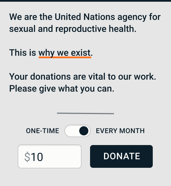
I felt that associating the purpose statement with a call to donate had to be a good way to boost donations. I created a module which included a very simple donation form, which once submitted would lead the user to a second form where their payment information could be collected. The idea was to minimise the effort required for the user to commit to taking action.
The module is designed to fit into the lefthand column on larger viewports so it can sit alongside the primary page content as an ever present reminder to donate and support the work of the UNPF.
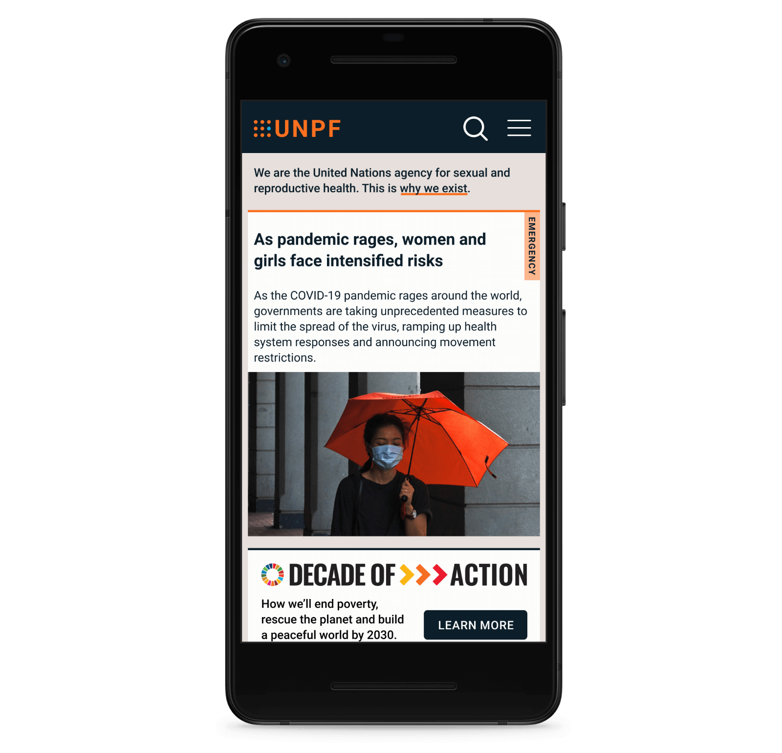
On mobile the module adapts to only show the purpose statement and link. My gut feel was that mobile users were less likely to donate and I didn't want to cramp the primary page content with donation forms if users were unlikely to respond. That said, it would certainly be worth testing.
Returning to the About page and applying the new design, I feel like I've been somewhat successful in making users more likely to donate. The brand visuals and tone of voice certainly seem more forceful and persuasive. But designing this page did stretch my UI skills. The inclusion of an image was a bit of cop-out having spent a lot of time trying to use white space more effectively to create visual impact. Reducing the number of elements on the page is still something I find difficult and need to work on.
I should acknowledge the existence of Friends of UNFPA which look to be the fundraising arm of UNFPA, although I'm not sure the exact relationship. For me, consigning your public fundraising to another entity is the wrong strategy and may exacerbate donor fears over accountability and efficiency. Any organisation reliant on public support should make fostering that relationship a core purpose of their website.