Conversion Rate Optimization - Flybe
As Lead UX I was asked to redesign this critically important page template, optimizing the design to attract and convert organic search traffic.
“Cheap flights to {destination}” is a very competitive set of search terms among airline carriers and flight aggregators - offering both high frequency (traffic) and high conversion rates.
Flybe hadn’t updated the design of their landing page template for some time, and needed to allow room in the new template for additional copy with the aim of improving their organic search rankings.
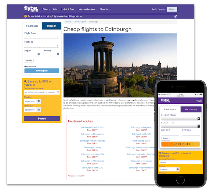
Analysing the existing design
I used SessionCam to observe users interacting with the page, and Google Analytics to gather aggregate data.
The design had some obvious weaknesses:
- No flights appear above the fold
- Flights don’t look clickable
- Lack of obvious call to action
- Flight search form not pre-populated
- Hotel search form not really relevant
- Lack of social sharing options

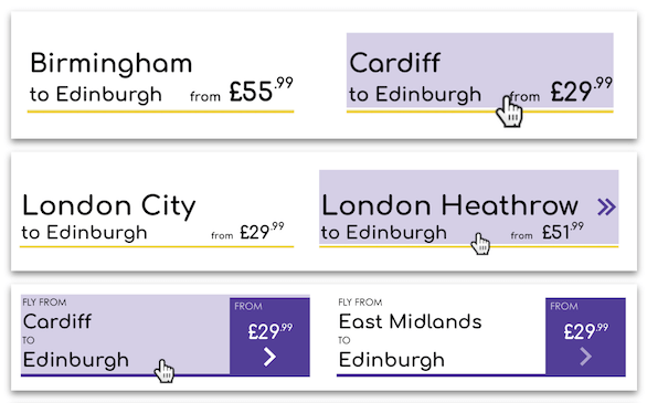
Designing the route price lock-up
The most important component of the redesign was the route price lock-up. It needed to:
- Clearly display the lowest available price for a particular flight route
- Appear obviously interactive and clickable
- Work in all viewports and device types
- Conform with pricing legislation
- Handle long airport names like “Paris Charles De Gaulle”
- Work in multiple contexts throughout the website
Below are some of the design iterations I went through.


I worked with the marketing team to ensure that the new component would work in multiple contexts throughout the website - on the homepage, in flash sales and destination promotions, route pages, blog posts and campaign landing pages.

I also worked closely with the backend developer on the logic behind the pricing algorithm, getting consensus agreement from legal and yield management.
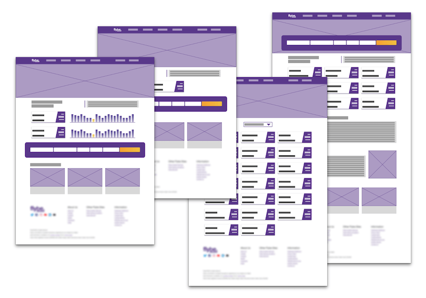
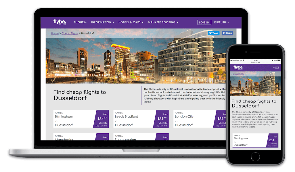
New template design
The new design featured a full-width hero image for a more modern look. Content above the fold was carefully considered, so at least one flight was visible at all viewport widths. Each flight route price was clickable and would drop the user straight into the booking flow, with no need to fill in a search form.

I had hoped to AB test the new template against the existing design but we were constrained by technical capabilities. Instead, we rolled the new design template out gradually, observing the performance of updated destinations against non-updated destinations.
Over the course of a month the new template acheived an average 15% more organic visits, 37% lower bounce-rate, 52% higher conversion rate, and 60% increase in revenue attribution.