Booking flow - Thomas Cook Group Airlines
Mobile-first site redesign covering competitor analysis, journey mapping, requirements gathering, design prototyping and testing.
Thomas Cook Group Airlines had undergone a major systems migration, moving all Group websites to a shared Amadeus Altéa backend. The project had overrun and the new frontend had fallen out of scope before it reached production.
Starting with our customers
I wanted to get an understanding of how the booking of flights fitted into our customers’ lives so I commissioned a series of focus groups. I also ran a series of one-on-one interviews with participants recruited to match our persona demographics.
Insights gathered from this primary research were used to create a customer journey map, and to begin thinking about the most important touch-points within the journey.

User needs vs business needs
Our customers were telling us that they found booking flights stressful and difficult. They wanted simplicity – clear options, transparent prices, and an easy payment flow.
But the airline business depends on selling ancillary products. We have to persuade customers to pay for seat reservations, meals or extra baggage as there’s basically no profit in selling a naked economy fare.
I feel like I'm doing the work that used to be done by the travel agent, but at least it's booked now!
-- Interviewee describing their online flight booking
Persuasion vs configuration
The two essential functions of the booking flow are:
- first to persuade customers to buy
- then to enable them to configure their prefered options
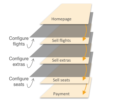
The previous design combined these functions at each step in the flow, simultaneously attempting to convince the customer to buy and configure options, resulting in a complex UI that performed poorly for users and the business.
I had the idea to seperate persuasion from configuration, using the primary on-page space to sell and creating a secondary off-page space to configure options. The sales space could be optimised purely for persuasiveness, and the configuration interactions optimised for usability.
Testing mobile interaction patterns
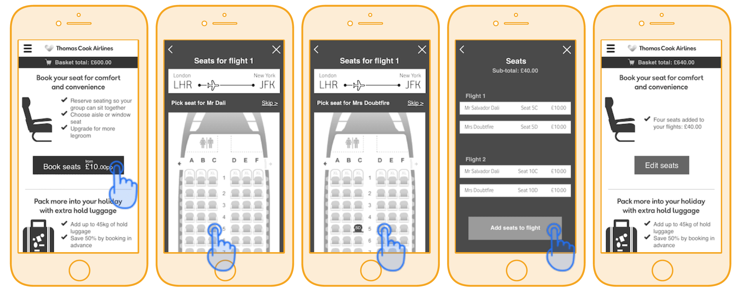
I built a series of low-fidelity prototypes to test different interaction patterns, initially guerrilla testing with colleagues in the office.
Each product had a single on-page call-to-action, which seemed to work well for users and gave space for sales messaging. The configuration flow took more work – finding the right balance between hand-holding the user and allowing affirmative progression through the flow.
Evolution of the search result page
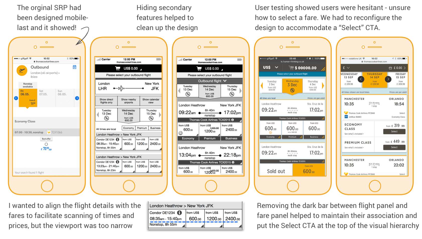
Designing the flight search results page was one of the biggest challenges in the project. Search results are complex, containing a lot of data that's important to the user. Finding a way to successfully present the data on a mobile screen took several design iterations.
The development process
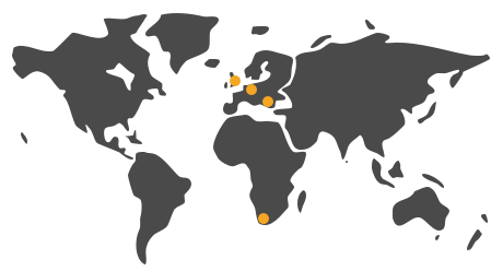
This project was truly international. The UX and design was completed in London, with user testing in London and Berlin. The HTML and CSS was built in Cape Town. The Angular JS application and backend integration was developed in Frankfurt, and we were supported by a QA team in Sofia.
The project followed a waterfall delivery process although we did adopt some Agile methods in the design and frontend build – working in sprints, having daily standups, using show-and-tells to walk through new features. Video conferencing was crucial and Slack was used to fill in communications between calls.
Working with the integration team in Germany was much more difficult, and although we made every effort to schedule video conferences, we found that the best results came from face-to-face meetings, so trips to Frankfurt became a regular part of the project.
Lesson learned
The UX design was reliant on a set of transitions to orientate and guide the user through the flow. These were particularly problematic to build because of the split of HTML/CSS and JavaScript between the two development teams.
In the end we simplified the transitions enough to get something delivered, though they are not as performant as I would like. It’s a compromise we could have reached sooner. I could have also argued more forcefully against the division of frontend development.
Optimizing for success
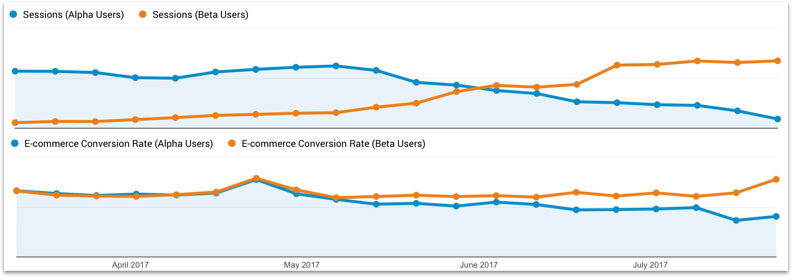
The new booking flow was initially put live to a small portion of traffic as an A:B test against the old flow. As bugs were fixed and confidence grew in the new flow, more and more traffic was pushed away from the old flow until it was decommissioned altogether.
Throughout the transition period and beyond, we continued to test the flow with users, iterating the design to increase conversion rate and average booking value.
Results
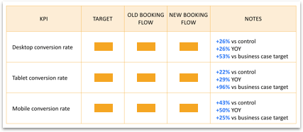
The new design exceeded the commercial targets specified in the business case. We also saw a positive response in customer feedback, and an improvement in our Customer Effort Score metric.
New booking website and confirmation pages are much easier to understand and navigate. The comprehensive breakdown of costs, per passenger, on the confirmation is very useful. Excellent improvement over the previous site.
-- Usabilla feedback on new booking flow
